AI News
24 Apr 2026
Read 16 min
ChatGPT Images 2.0 text rendering capabilities explained
ChatGPT Images 2.0 text rendering capabilities let creators generate legible in-image text very fast.
ChatGPT Images 2.0 text rendering capabilities now deliver clean, readable words inside generated images, across Latin and non-Latin scripts. The model follows layout instructions, checks its own output, and can produce multi-size assets up to 2K resolution. Here is how it works, where it helps, and what to watch before you ship.
Two years ago, AI image tools often spelled words wrong. Menus mixed up letters. Posters looked right from far away, but the text fell apart up close. That made it easy to spot AI. Today, the latest model from OpenAI can write and place text with far fewer errors. You can ask for a menu, a poster, or UI mock-ups, and read the words clearly.
OpenAI calls this model Images 2.0. It is part of ChatGPT and also available through an API. The company says it can “think,” search the web, make many samples from one prompt, and double-check results. In practice, that means better control, better spelling, and stronger layout skills. These gains matter for real work like marketing, product design, and publishing.
Understanding ChatGPT Images 2.0 text rendering capabilities
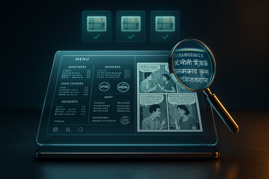
OpenAI says the model can follow detailed instructions and keep small features accurate. That includes small text, icons, UI pieces, dense layouts, and fine style rules. You can ask for banners, Instagram posts, and posters with the same theme and different sizes. It can also create multi-pane comics that keep characters, speech bubbles, and panels consistent. Output goes up to 2K resolution. The model shows progress in non-Latin writing, too. It handles scripts like Japanese, Korean, Hindi, and Bengali better than past versions. That helps teams serve global audiences without redrawing text by hand. You still should check each language with a native speaker. But early results are much stronger than the blur and garble from older tools. OpenAI has not shared what kind of model sits under the hood. In the past, diffusion models struggled with letters because they rebuild images from noise. They focus on big shapes, not tiny glyphs. Some researchers favor autoregressive models for text, since they predict tokens in order, like a language model. We do not know which path OpenAI used here, but we can see the effect: letters look like letters, in the right order, at the right place. The company also says the model can search the web and “verify” its own output. That can help with correct names, dates, and brand spellings, though you should still review results. The knowledge cutoff is December 2025, so the model may not know the latest news or new brand rules.From blurry glyphs to clean letters
Older image generators often produced letter-like shapes that fooled the eye from a distance. Up close, you saw swapped letters or missing strokes. Images 2.0 makes tighter letterforms and keeps spacing more stable. It also respects common layout asks, such as:- Put a headline at the top, centered.
- Keep a list in two neat columns.
- Fit body text in a box with a set margin.
- Use sentence case or ALL CAPS when told.
Non-Latin scripts and multilingual support
Teams making global assets should test each language on real devices. The model can render Japanese, Korean, Hindi, and Bengali with better fidelity than before. Still, fonts, line breaks, and ligatures can be tricky. Keep these tips in mind when you work across languages:- Ask for a widely available font or a style family (serif, sans-serif) if a specific font is not allowed.
- State the script and language in the prompt, not just “Asian characters” or “Indian text.”
- Provide the exact text you want, not just a topic, to avoid wrong names or off-brand phrases.
- Run a native review before you publish.
How it compares to older image models
Past models often turned “menu” into made-up words. They broke long phrases. They struggled to keep the same font across a layout. In side-by-side tests, Images 2.0 holds the line better. Headlines read clean. Lists are legible. Logos and icons come out more consistent. You can scale a theme across sizes without redrawing. We still do not have the full technical story. OpenAI did not confirm the architecture. But the gains suggest better planning and stronger step-by-step control. The model seems to reason about layout first, then render text and design elements with tighter bounds. That is why small UI items and dense compositions survive the process, where older tools smeared them. These upgrades show how ChatGPT Images 2.0 text rendering capabilities surpass what many teams expect from AI art tools. The gap shows most when you ask for specific details: exact wording, strict layout, icons in the right order, or a brand color and font style. This is no longer just “paint me a style.” It is “ship me an asset.”Practical uses you can ship today
Here are real tasks where the model already helps:- Restaurant menus that stay readable and on-brand across print and digital sizes.
- Event posters with clear dates, times, and venue lines you can scan at a glance.
- Social ad sets for multiple platforms, all following one theme and copy deck.
- Packaging mock-ups where legal copy remains legible at small point sizes.
- App store screenshots with sharp UI text and consistent icons.
- Multi-panel comics for pitches and storyboards with stable characters and speech bubbles.
- Internal dashboards or product vision boards that need fast, readable visuals.
Prompt patterns that work
To get the most from ChatGPT Images 2.0 text rendering capabilities, write prompts that act like a short creative brief. Be clear about the text, layout, and style. Here are prompt moves that pay off.Structure your prompt like a mini-brief
Spell out the key content first. Then list layout rules.- Goal: “Create a cafe menu for spring specials.”
- Exact text: provide the headline, section titles, and item names with prices.
- Layout: “Two columns, headline centered top, footer with address.”
- Style: “Warm, minimal, cream background, dark brown text, sans-serif.”
- Output: “1024×1536 vertical, print-safe margins.”
Constrain the layout
When text matters, constraints help. Name the zones (headline, body, footer). Give alignment (left, center, right). If you need strict blocks, say “place body copy inside a clean rectangular text box with 20px padding.”Specify style and typography
If brand fonts are licensed, describe them instead of naming them. For example, “modern geometric sans-serif, medium weight, tight tracking.” State case rules: “Use title case for the headline. Use sentence case for body text.”Iterate and verify
Ask for three to five variations in one prompt. Request a “self-check” on spelling and numbers. If you see a mistake, point to it with clear edits: “Change ‘Tues’ to ‘Tue.’ Move the price to the same line as the item name.” A few short rounds beat one long prompt.Speed, cost, and access
All ChatGPT and Codex users can access the model. Paid users can generate more advanced outputs. If you build tools, you can use the gpt-image-2 API. Pricing depends on output quality and resolution. The model is fast enough for work. A simple poster may render in under a minute. A multi-panel comic can take a few minutes. Plan batch time if you make large sets. Even with strong ChatGPT Images 2.0 text rendering capabilities, keep a human review step in your workflow. Add time for final checks. Lock a version before you publish.Quality checks and brand control
Treat the model like a junior designer who works at high speed. Give it a checklist, and review its work.- Spell-check all copy, including names and numbers.
- Confirm brand colors with hex codes. If the brand has strict fonts, swap them in after generation.
- Test legibility at real sizes. Print if the asset is for print.
- Use a native speaker review for non-Latin scripts.
- Export with safe margins so nothing gets cut in print or in-app crops.
Limitations and risks to manage
The model’s knowledge ends in December 2025. It may not know recent events, new products, or updated brand slogans. If you ask it to pull details from the web, verify the source and the result. The “double-check” step helps, but do not rely on it for legal or medical claims. Be careful with sensitive content and trademarks. Do not ask for assets that you do not have the right to use. If you need strict compliance copy on packaging or ads, paste the exact, approved text into your prompt. Keep a record of approvals. The model is much better at short to medium text blocks than long essays. For long text, generate the design with placeholder copy first. Then place final text in a design tool. That keeps line breaks and hyphenation under control.Design tips that boost legibility
Small choices improve results, even with a strong model:- Contrast: Light text on dark backgrounds or dark text on light backgrounds reads best.
- Hierarchy: Use one strong headline, clear subheads, and calm body text.
- Spacing: Ask for generous line height for body text; tight tracking for headlines only.
- Simplicity: Limit to two font styles (e.g., one sans-serif, one serif) to avoid visual noise.
- Alignment: Keep body text left-aligned for easy reading; center only short lines.
Team workflows that fit
Blend AI speed with human control:- Give the model the brief and exact copy to produce first drafts in many sizes.
- Have a designer refine spacing, swap licensed fonts, and polish alignment.
- Let a copy editor proofread everything, including small captions and legal lines.
- Run a final brand review, then export to your delivery formats.
What to watch next
OpenAI has not shared full details about the engine inside this model. But the trend is clear: better planning, better control, and better letters. Expect stronger layout tools, more precise text boxes, and maybe live editing of words after render. Look for deeper integration with copy workflows, like syncing approved text from a CMS. We will also see richer multilingual support as more scripts get training love. As teams adopt these tools, expect standards for review, sourcing, and disclosure to firm up. The winners will be the teams that mix speed with care. As a closing thought, the jump we see today feels like the move from “AI art” to “AI design.” The tool does not replace designers or writers. It amplifies them. It clears the busy work and gets you to a strong draft fast. In short, ChatGPT Images 2.0 text rendering capabilities turn AI images into assets you can read, use, and trust after a quick review. With the right prompts, checks, and brand rules, you can ship more work, in more languages, with fewer mistakes.For more news: Click Here
FAQ
Q: What improvements does ChatGPT Images 2.0 make to text in generated images?
A: ChatGPT Images 2.0 text rendering capabilities deliver cleaner, more readable words inside images and preserve small text, iconography, UI elements, and dense layouts up to 2K resolution. The model follows layout instructions and double-checks its output, reducing the spelling and glyph errors common in older generators.
Q: Which non-Latin scripts does Images 2.0 handle better?
A: OpenAI says Images 2.0 shows stronger understanding of non-Latin text rendering in languages like Japanese, Korean, Hindi, and Bengali. You should still run a native speaker review for each language before publishing.
Q: How should I write prompts to get accurate text and layout from the model?
A: Structure your prompt like a short creative brief with the exact text, clear layout rules, style notes, output dimensions, and a request for multiple variations and a self-check. This prompt pattern helps ChatGPT Images 2.0 text rendering capabilities follow placement, case rules, and typography constraints.
Q: Can Images 2.0 produce real marketing assets and multiple sizes for campaigns?
A: Yes, Images 2.0 can create marketing assets across sizes—banners, posters, social ad sets, and multi-paneled comics—and it can output up to 2K resolution. Designers should still proofread, swap licensed fonts if needed, and test legibility at final sizes before shipping.
Q: Who can access Images 2.0 and is there an API for developers?
A: All ChatGPT and Codex users can access Images 2.0, with paid users able to generate more advanced outputs. OpenAI will also make the gpt-image-2 API available, with pricing dependent on output quality and resolution.
Q: What are the model’s main limitations and technical unknowns?
A: OpenAI declined to disclose the exact model architecture, so the internal method powering the improvements is not confirmed. The model’s knowledge cuts off in December 2025, so it may not reflect the newest events or brand changes, and its self-check should not be relied on for legal or medical claims.
Q: How fast is image generation with Images 2.0 for typical tasks?
A: Simple assets like posters can render in under a minute, while more complex outputs such as multi-panel comics may take a few minutes. Teams should plan batch time when generating large sets to fit production schedules.
Q: What quality checks and team workflows are recommended when using ChatGPT Images 2.0 text rendering capabilities?
A: Treat the model like a junior designer: provide the brief and exact copy to generate drafts, then have a designer refine spacing and swap licensed fonts while a copy editor proofreads all text. Confirm brand colors with hex codes, test legibility at real sizes, run native-speaker reviews for non-Latin scripts, export with safe margins, and lock a version with approval records before publishing.
Contents